1.3.1 Info and Relationships (A)
What WCAG says
Information, structure, and relationships conveyed through presentation can be programmatically determined or are available in text.
Understanding 1.3.1 Info and Relationships
What this means
When the structure of content is presented visually, such as in tables, lists and headings, that structure must also be understandable to assistive technologies such as screen readers and speech recognition tools.
Why it matters
Structure is important to understand information correctly. If different content types were only represented visually, people using assistive technology may miss information.
How to check
Use your browser’s developer tools, assistive technologies or a plugin such as WAVE to check that all content uses the correct HTML (Hypertext Markup Language). This includes:
- tables using
<table>,<tr>,<th>, and<td>elements - lists using
<ul>,<ol>and<li>elements - headings using
<h1>to<h6>elements - form fields have descriptive labels using
<label> - radio buttons or checkboxes have a
<fieldset>element to group them, and a<legend>element to provide a label for the group - form fields with extra information (such as a hint to say what format the input needs to be in) must be associated with that information in the code, for example using
aria-describedby- making the information more readable to screen reader users
If HTML cannot be used to convey all visual relationships then ARIA (Accessible Rich Internet Applications) code may also be used. However, standard HTML should be used wherever possible.
How to test in detail for 1.3.1 Info and Relationships
Good examples
Headings and lists marked up correctly
When content introducing a section is correctly coded as a heading, it allows people to navigate between those headings using assistive technology. It also helps to break up the page visually. This applies to lists as well. When correctly coded, a screen reader will announce how many list items there are.
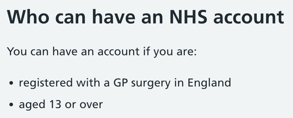
The following screenshot shows a heading of “Who can have an NHS account” followed by a bullet point list containing 2 items.
Simplified code:
<h2>Who can have an NHS account</h2>
<p>You can have an account if you are:</p>
<ul>
    <li>registered with a GP surgery in England</li>
    <li>aged 13 or over</li>
</ul>
Table with correctly marked up headers
When a table’s header cells are correctly coded, a screen reader user will be able to navigate around the table, as each data cell will announce the relevant header.
The header cells are usually in the first row, and sometimes in the first column.
In the following example, a screen reader should read “Second album” when navigating across to the data cell “Post”. This is essential so the user knows what the content is referring to.
This is achieved by using correctly marked up table header (<th>) tags which include scope="col". This relates the cells in each column to their headers.
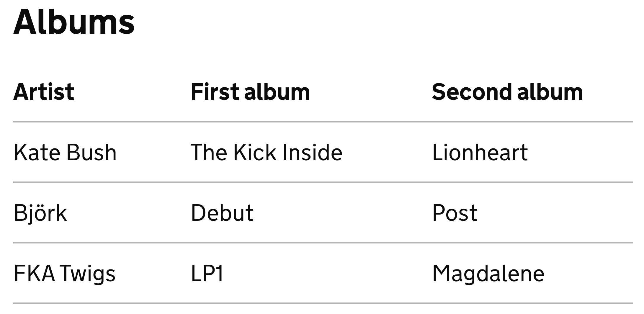
The top row of the table uses code <th scope="col">, meaning a table header (such as “Second album”) is related to the rest of its column.
Simplified code:
<table>
    <caption>Albums</caption>
    <thead>
        <tr>
            <th scope="col">Artist</th>
            <th scope="col">First album</th>
            <th scope="col">Second album</th>
        </tr>
    </thead>
    <tbody>
        <tr>
            <td>Kate Bush</td>
            <td>The Kick Inside</td>
            <td>Lionheart</td>
        </tr>
        <tr>
            <td>Björk</td>
            <td>Debut</td>
            <td>Post</td>
        </tr>
        <tr>
            <td>FKA Twigs</td>
            <td>LP1</td>
            <td>Magdalene</td>
        </tr>
    </tbody>
</table>
Common mistakes
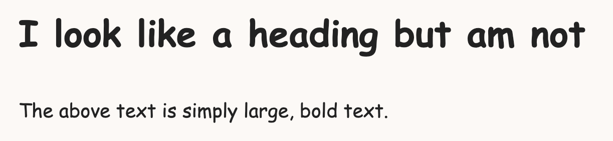
Heading not correctly marked up
A common issue is where headings have been styled using only bold and large text, rather than using a heading element such as <h1>. This makes navigation much more difficult for people who navigate by headings.
Code:
<!-- Don't do this -->
<p style="font-size: 36px; font-weight:bold">
  I look like a heading but am not
</p>
<p>The above text is simply large, bold text.</p>
List not correctly marked up
When a list of items is presented using line breaks to separate each item, it will not be announced as a list to screen reader users.
For example, the following “list” is not identified to screen reader users as a list along with the number of items in it:
apples
bananas
cherries
Code:
<!-- don't do this -->
<p>
    apples<br>
    bananas<br>
    cherries<br>
</p>
This should instead be coded using an unordered list (<ul>) and list item (<li>) tags.
Further examples
In general, this success criterion fails when the code does not match the visual appearance. Some more examples of failures are:
- table header rows rely on styled text instead of the correct HTML
- headings use the proper HTML markup, but the heading levels do not match the visual appearance, for example an
<h2>section heading appears smaller than an<h3>subsection heading - form fields have labels but they are not associated with the relevant field
Related success criteria
This success criterion is closely related to several others. In some cases, more than one of these criteria might fail at the same time:
- 1.1.1 Non-text Content covers images and symbols having appropriate alternative text.
- 1.3.2 Meaningful Sequence makes sure that the reading order of content is logical.
- 2.4.6 Headings and Labels makes sure that labels are descriptive.
- 2.5.3 Label in Name makes sure that a component’s name (in the code) contains the visible label.
- 3.3.2 Labels or Instructions makes sure that elements have labels, but does not require them to be associated with each other.
- 4.1.2 Name, Role, Value interactive elements having appropriate names, roles and values, regardless of how they appear visually.